Dear Client
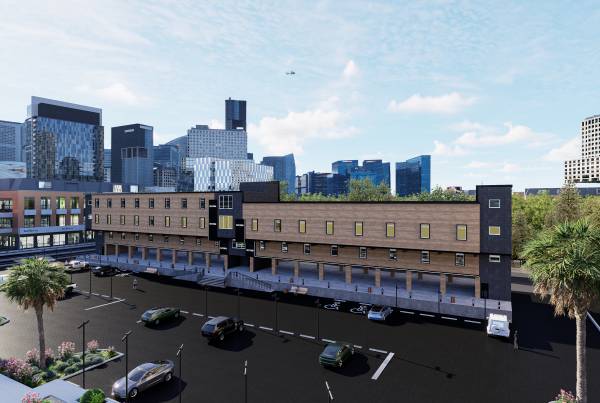
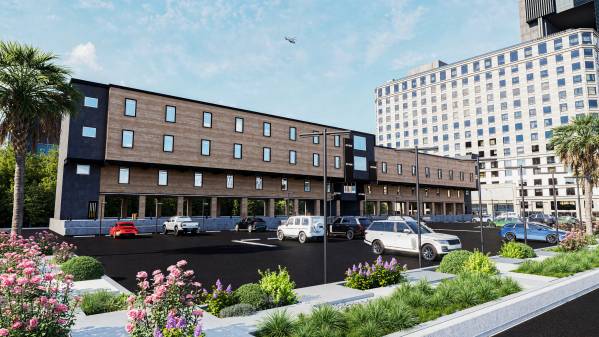
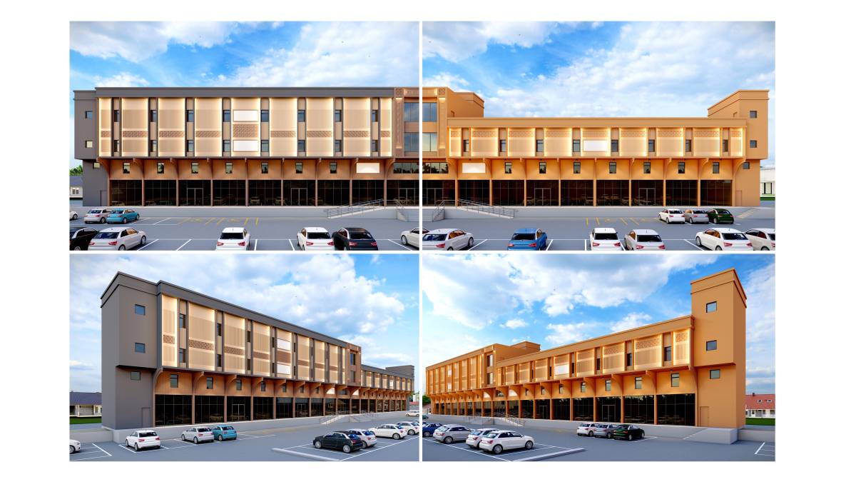
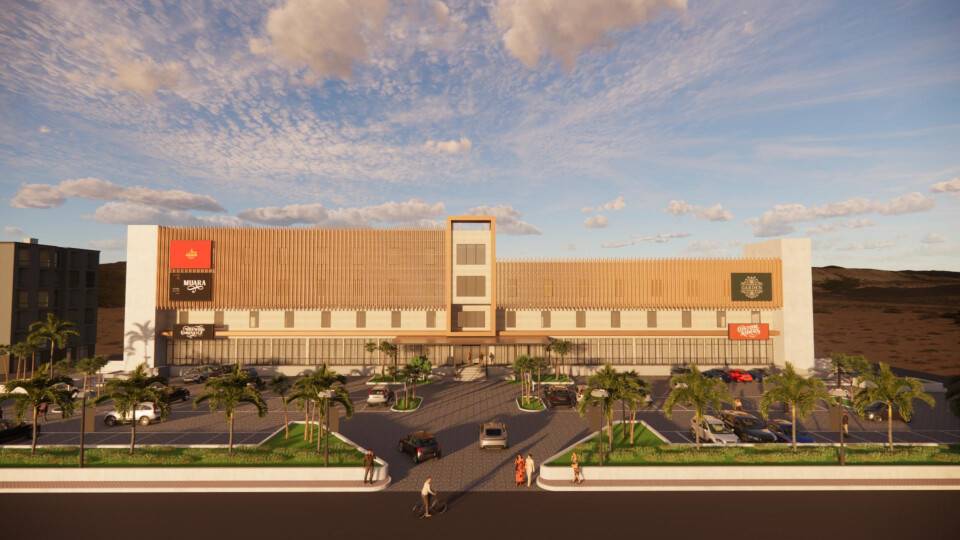
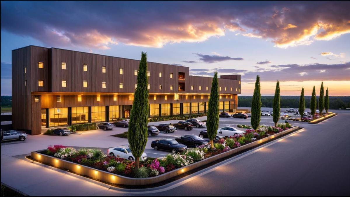
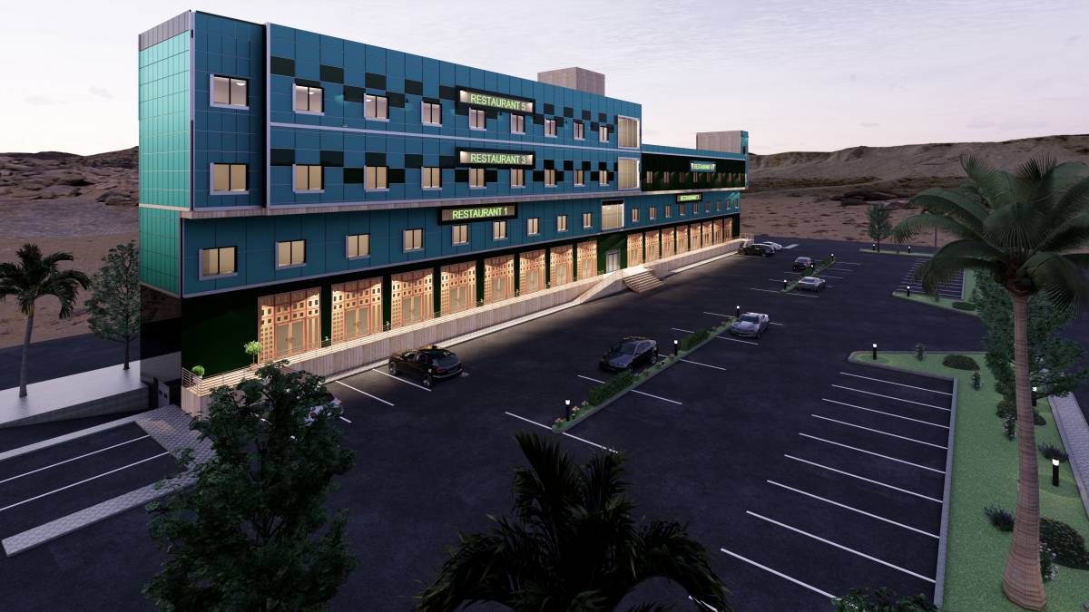
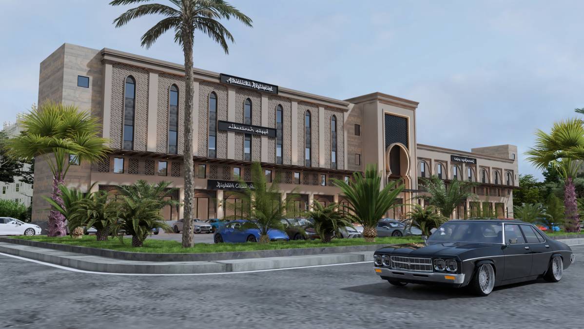
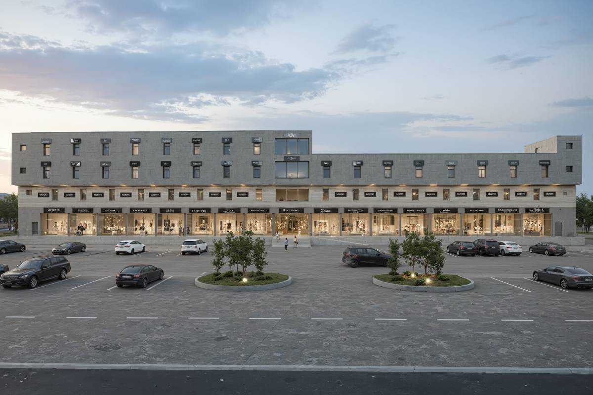
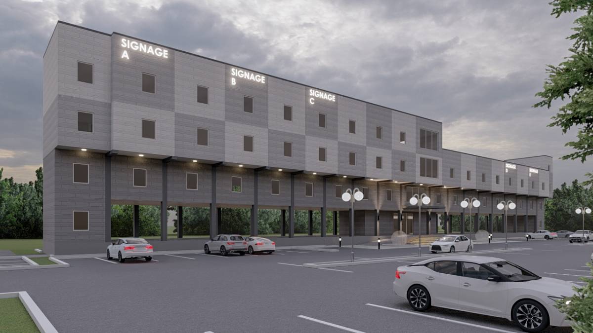
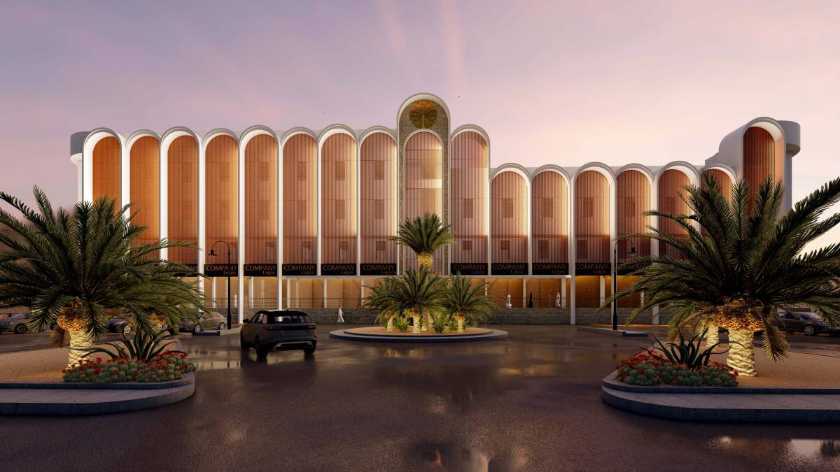
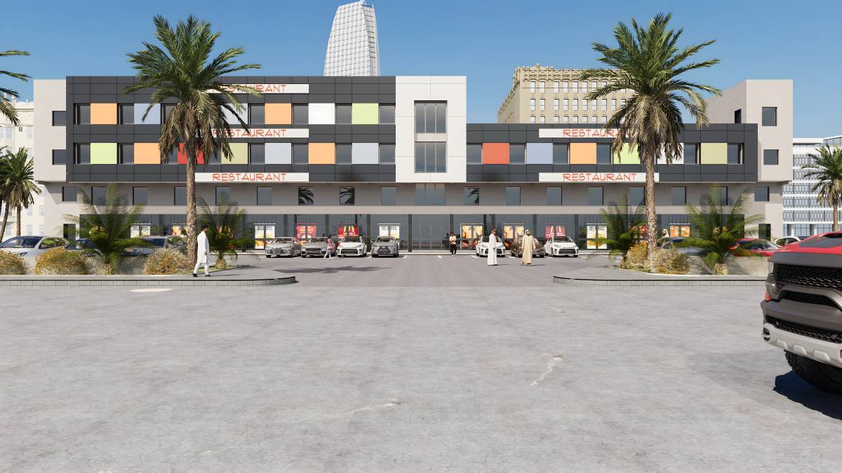
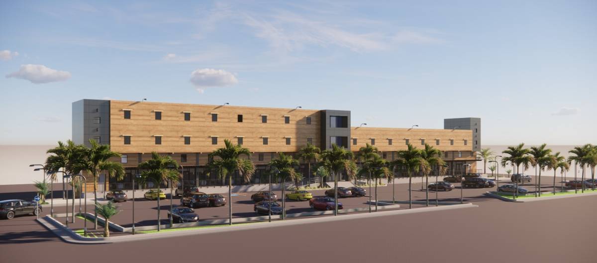
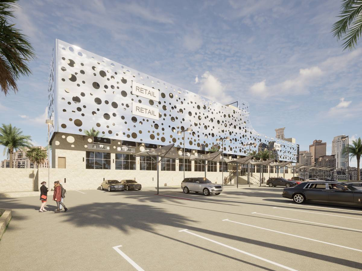
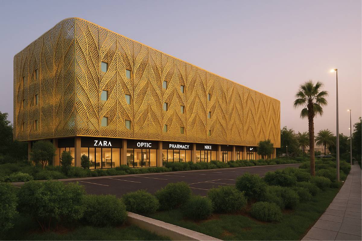
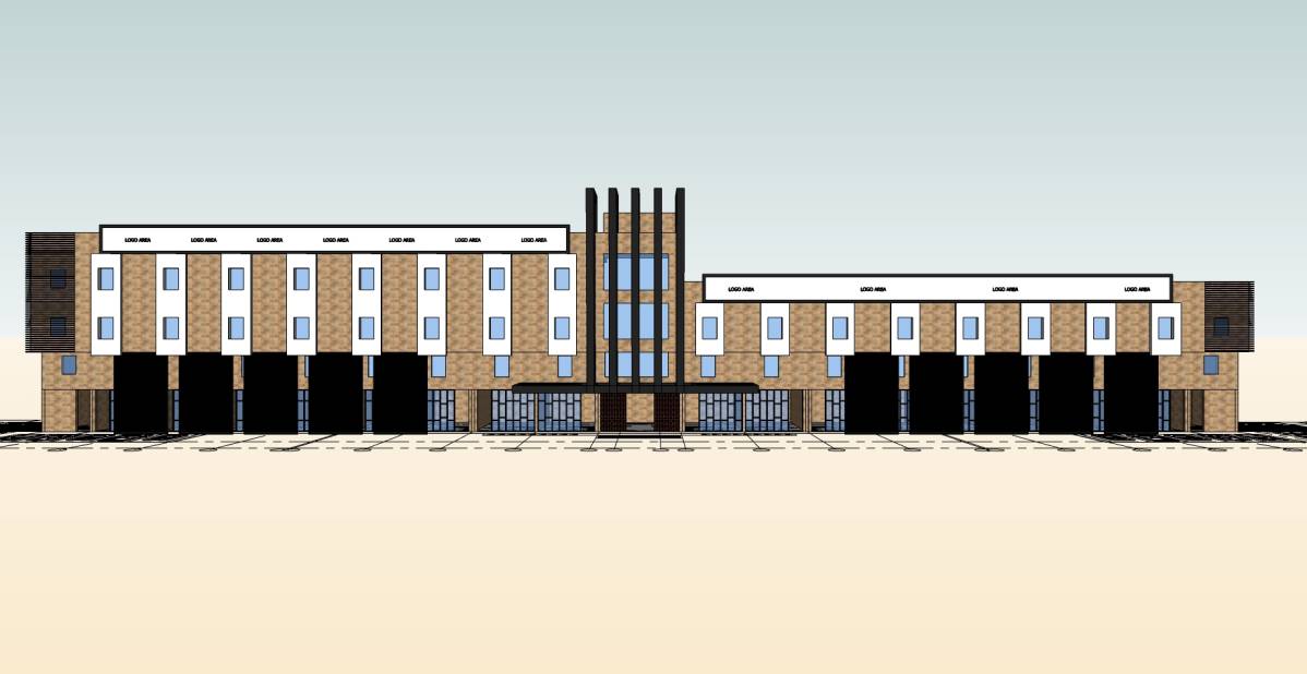
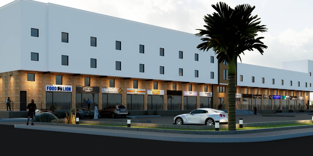
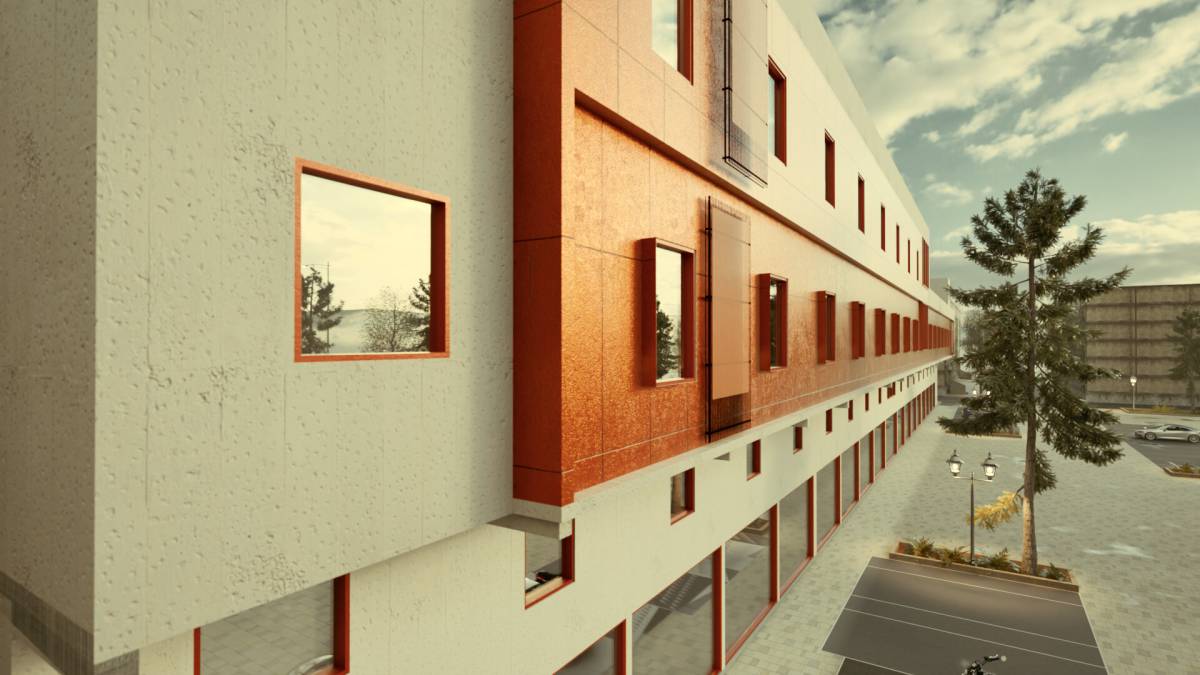
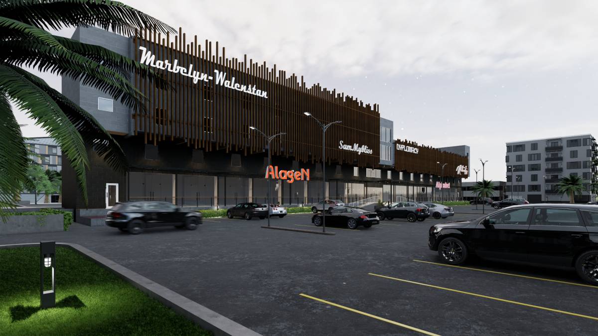
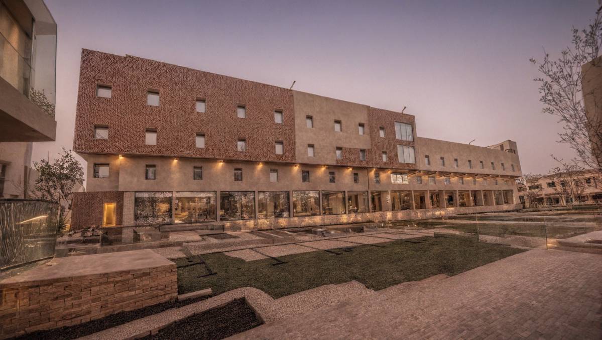
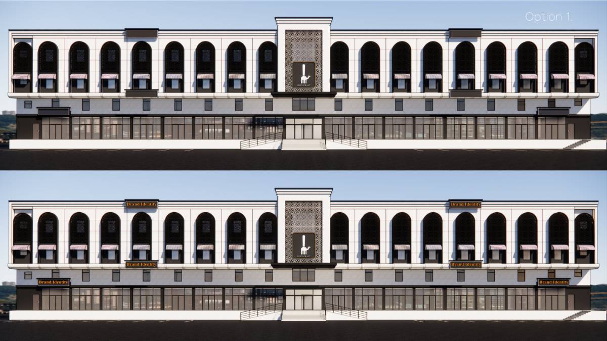
I have developed two façade design concepts for your building. Both options are tailored to enhance the identity of the project while meeting aesthetic, functional, and branding considerations.
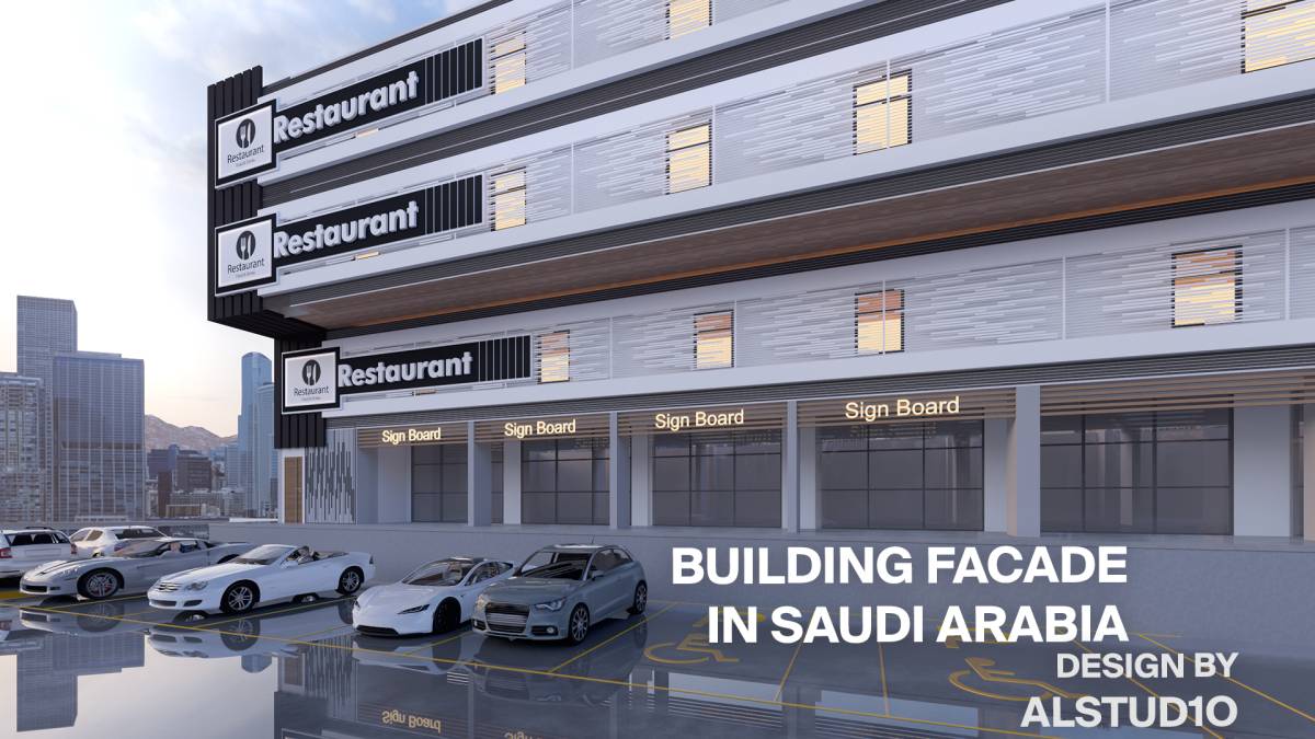
Concept 1: Vertical Rhythm and Iconic Central Element
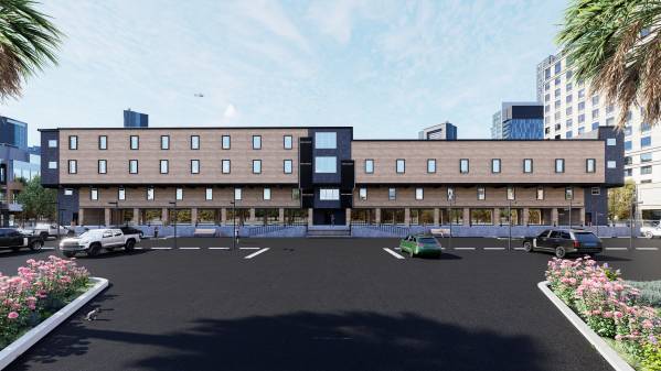
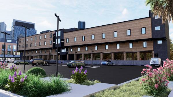
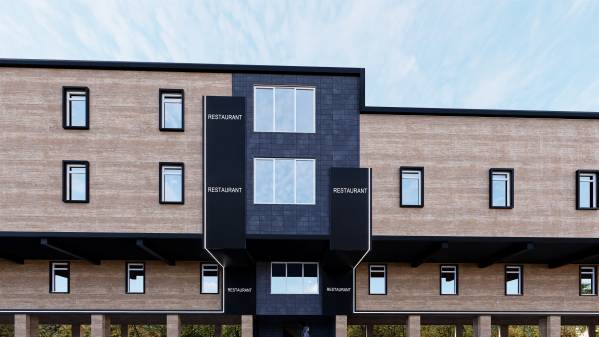
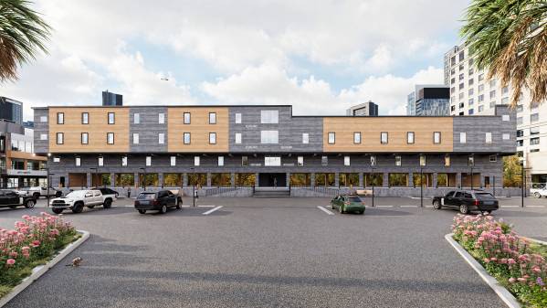
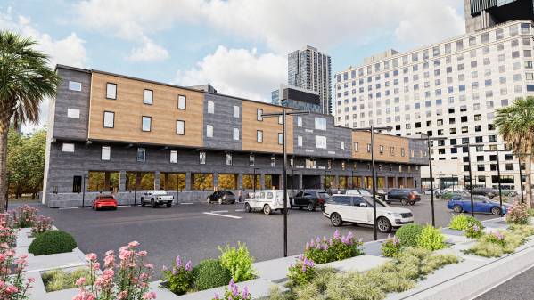
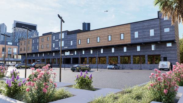
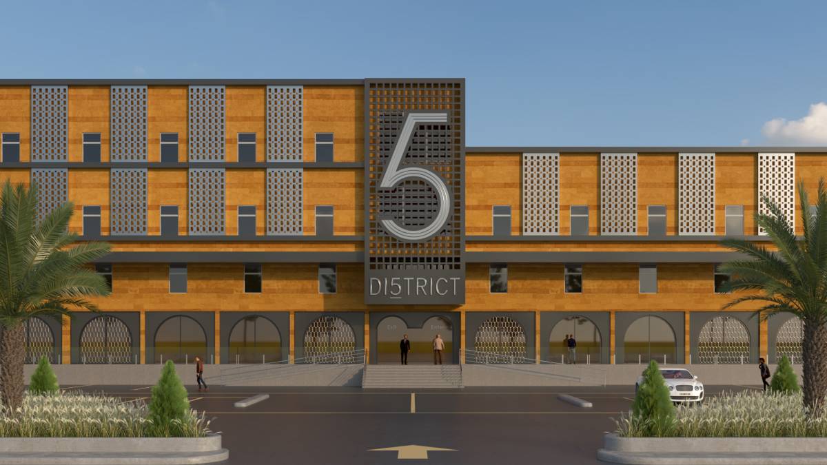
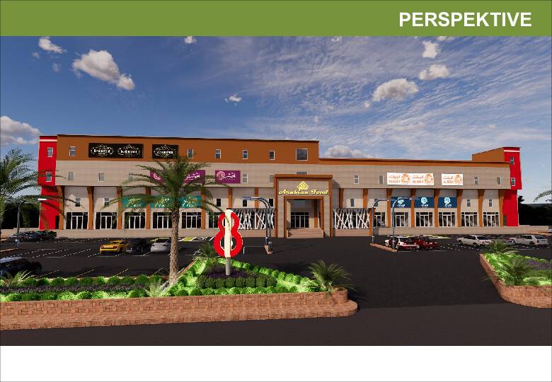
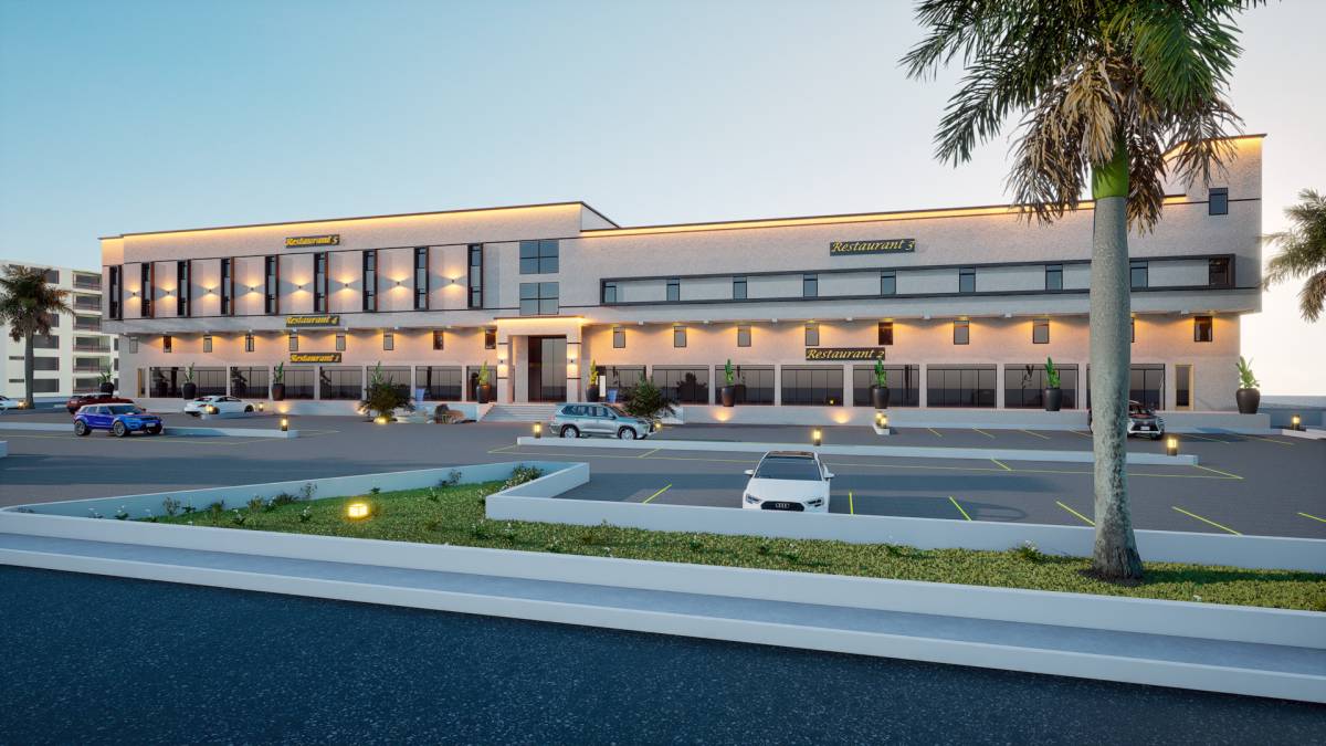
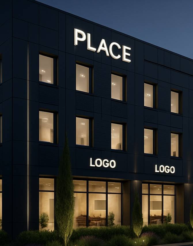
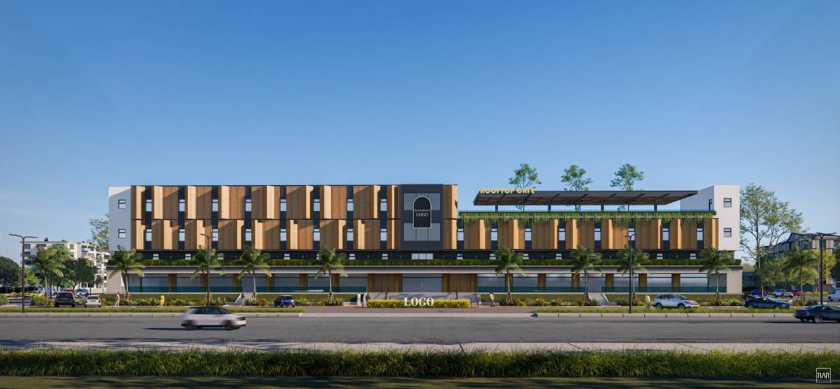
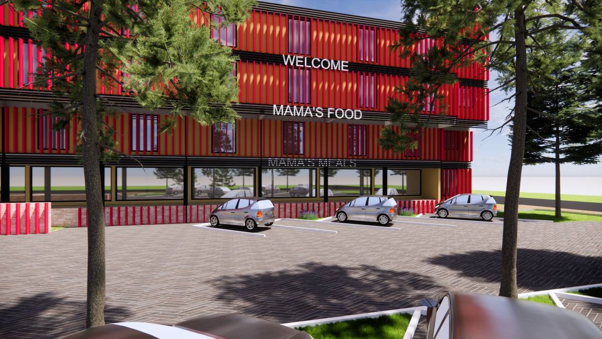
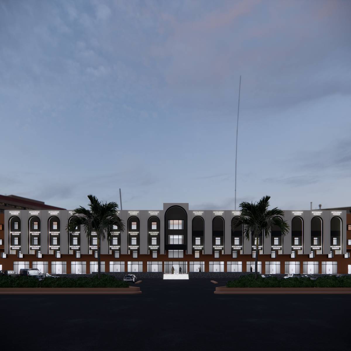
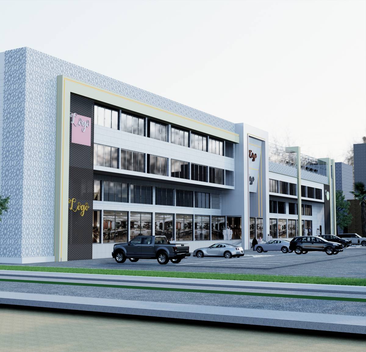
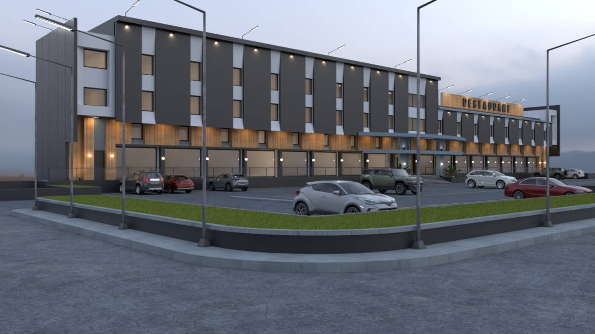
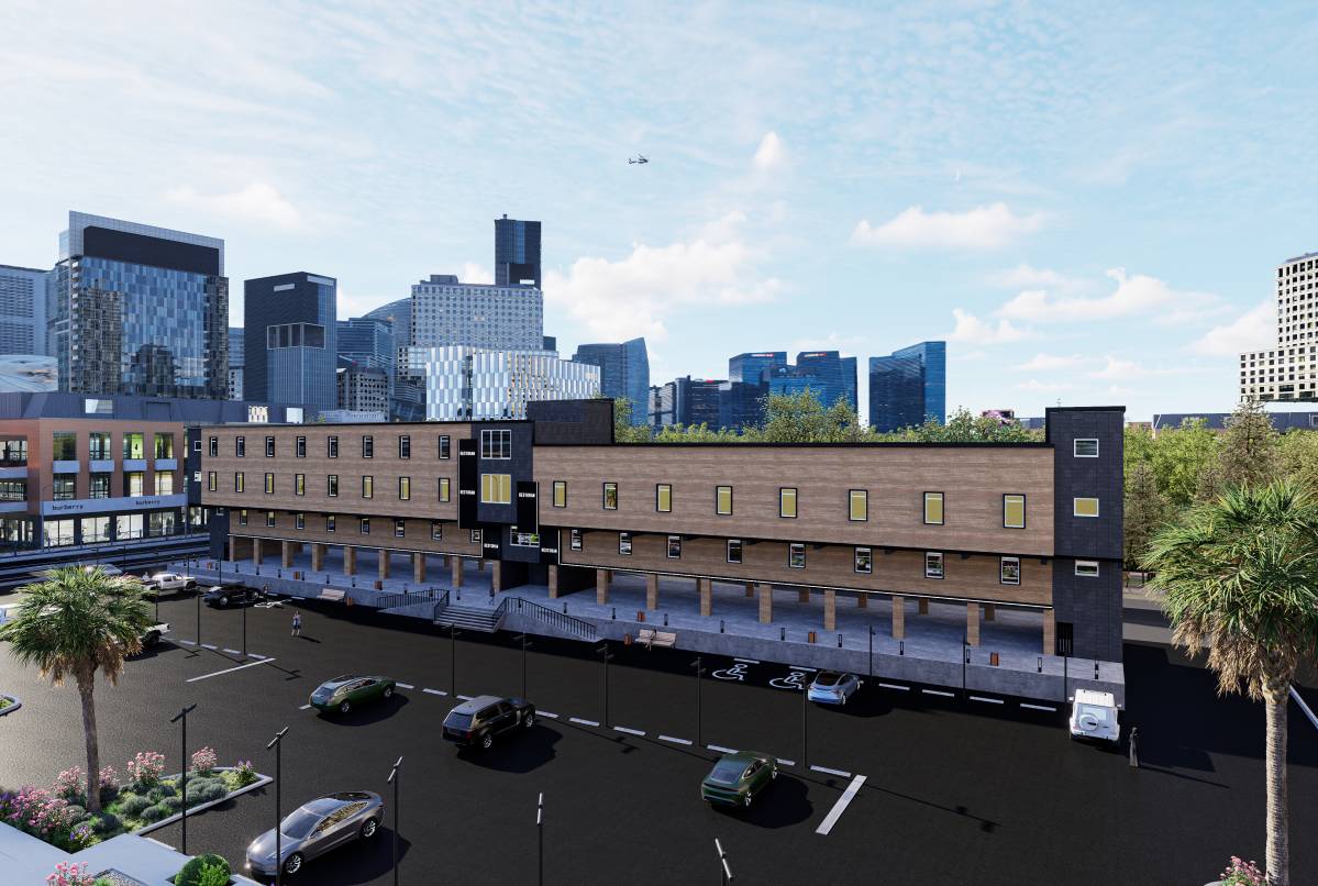
This design is characterized by vertically oriented dark grey panels that introduce depth and contrast to the façade. A central panel, placed prominently in the middle of the elevation, acts as a symbolic and memorable element — creating a sense of identity and an inviting gesture for visitors. This feature also serves as the main focal point of the composition.
To ensure visual harmony, the wooden surface beneath the building’s overhang has been rendered in black. Additionally, a slim panel strip has been integrated along the roofline to define the building’s silhouette and frame its upper edge.
All windows have been framed with the same panel material, aligning them with the overall façade language and avoiding a flat or disconnected appearance.
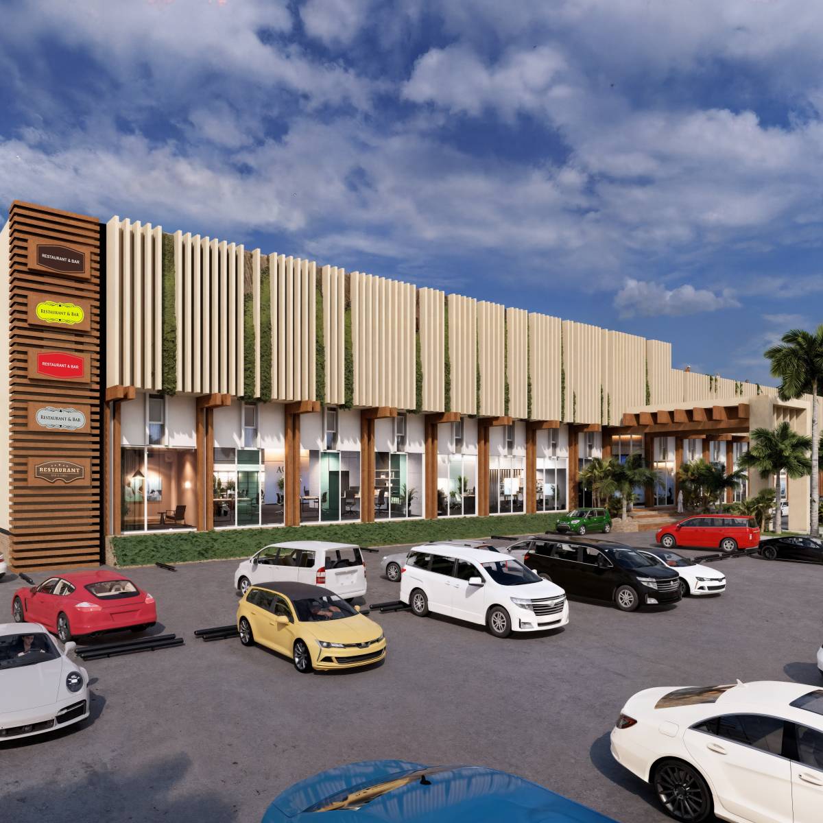
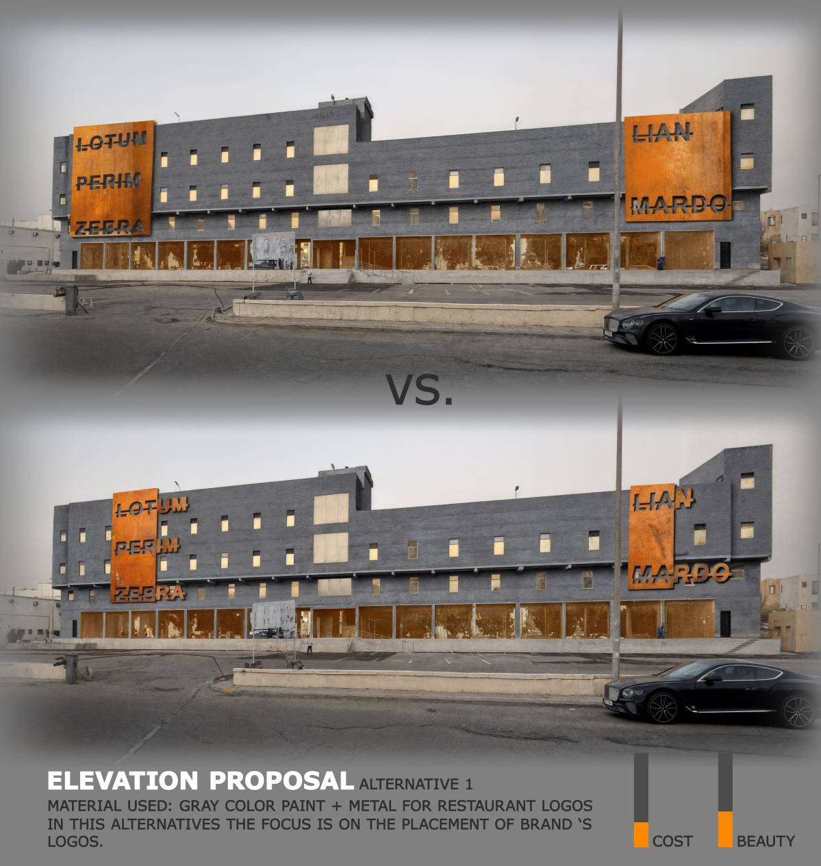
The signage panel for your five restaurants has been strategically positioned near the central corners of the façade. This placement creates visual contrast and ensures maximum visibility from the street, using clean, modern lines to attract attention.
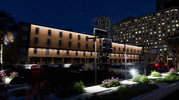
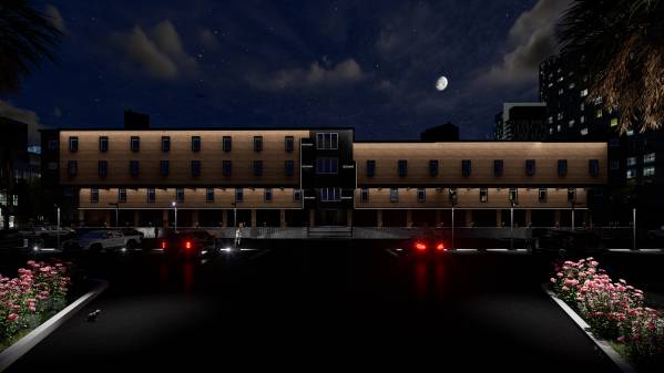
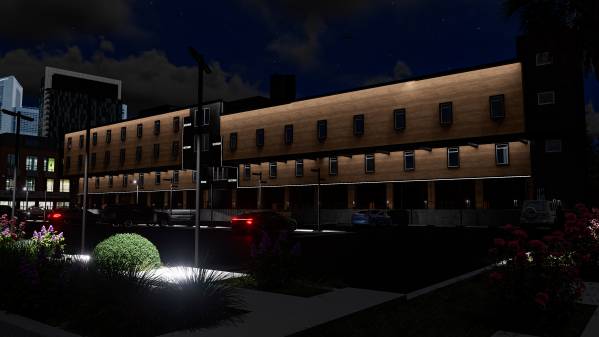
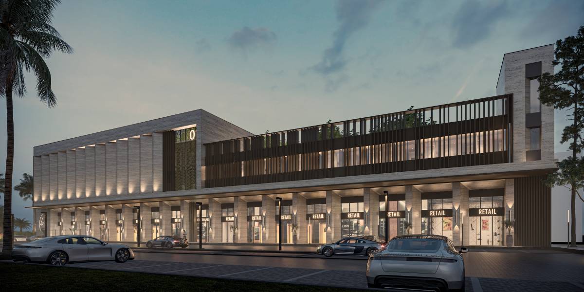
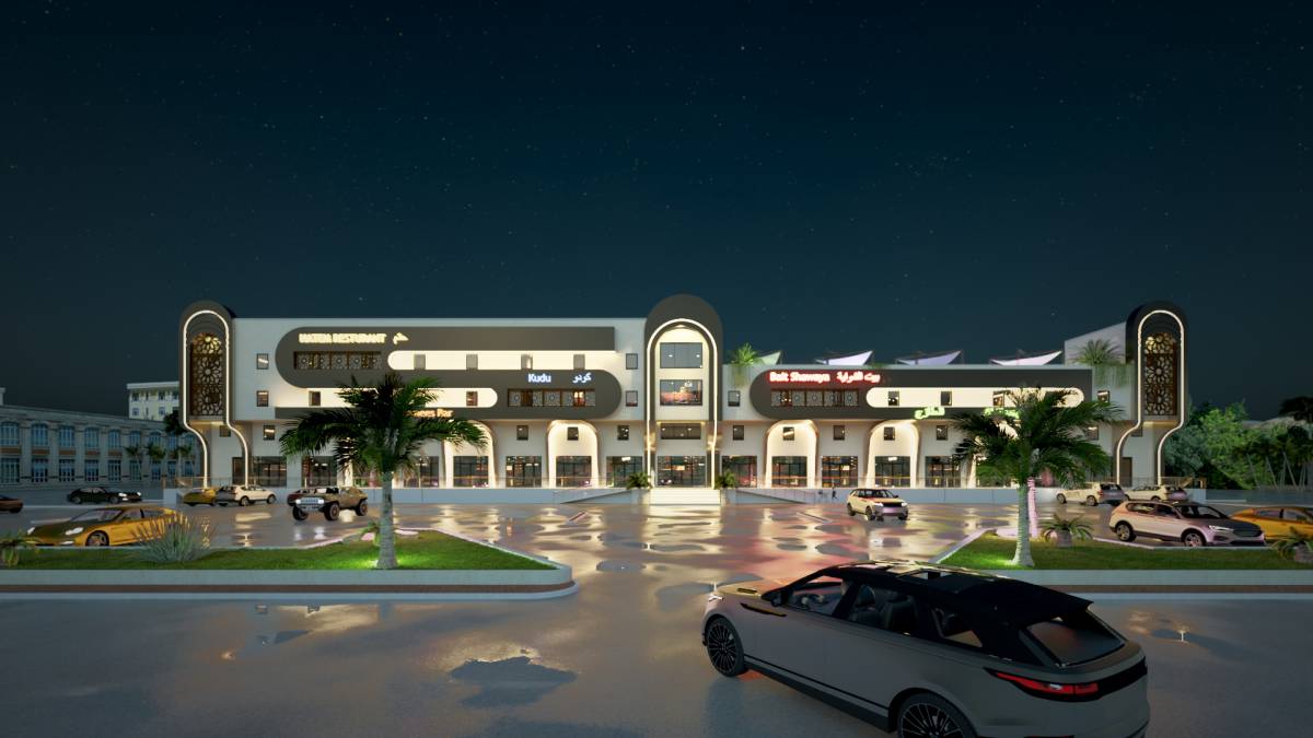
In the night renderings, you’ll notice concealed linear lighting beneath the roofline and under the wooden overhang. These provide soft illumination to the upper levels. Additionally, vertical lighting strips rise along the restaurant openings, aligned with the central panel, adding vibrancy and vertical emphasis to the design.
Concept 2: Visual Weight and Hierarchical Composition
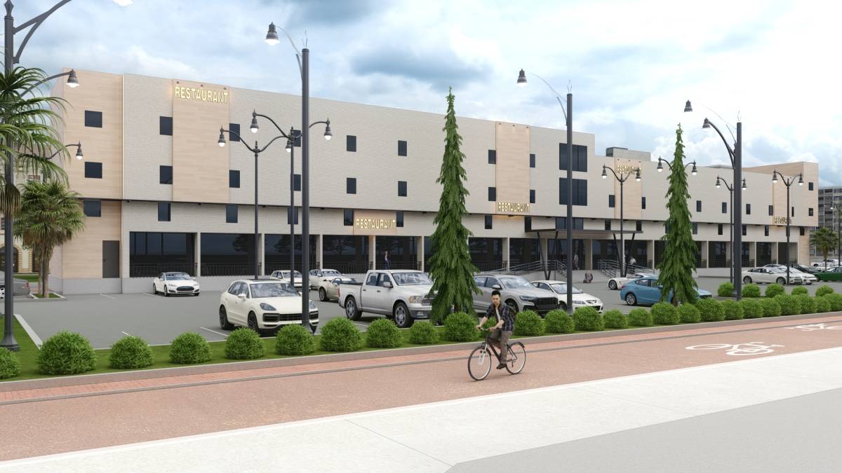
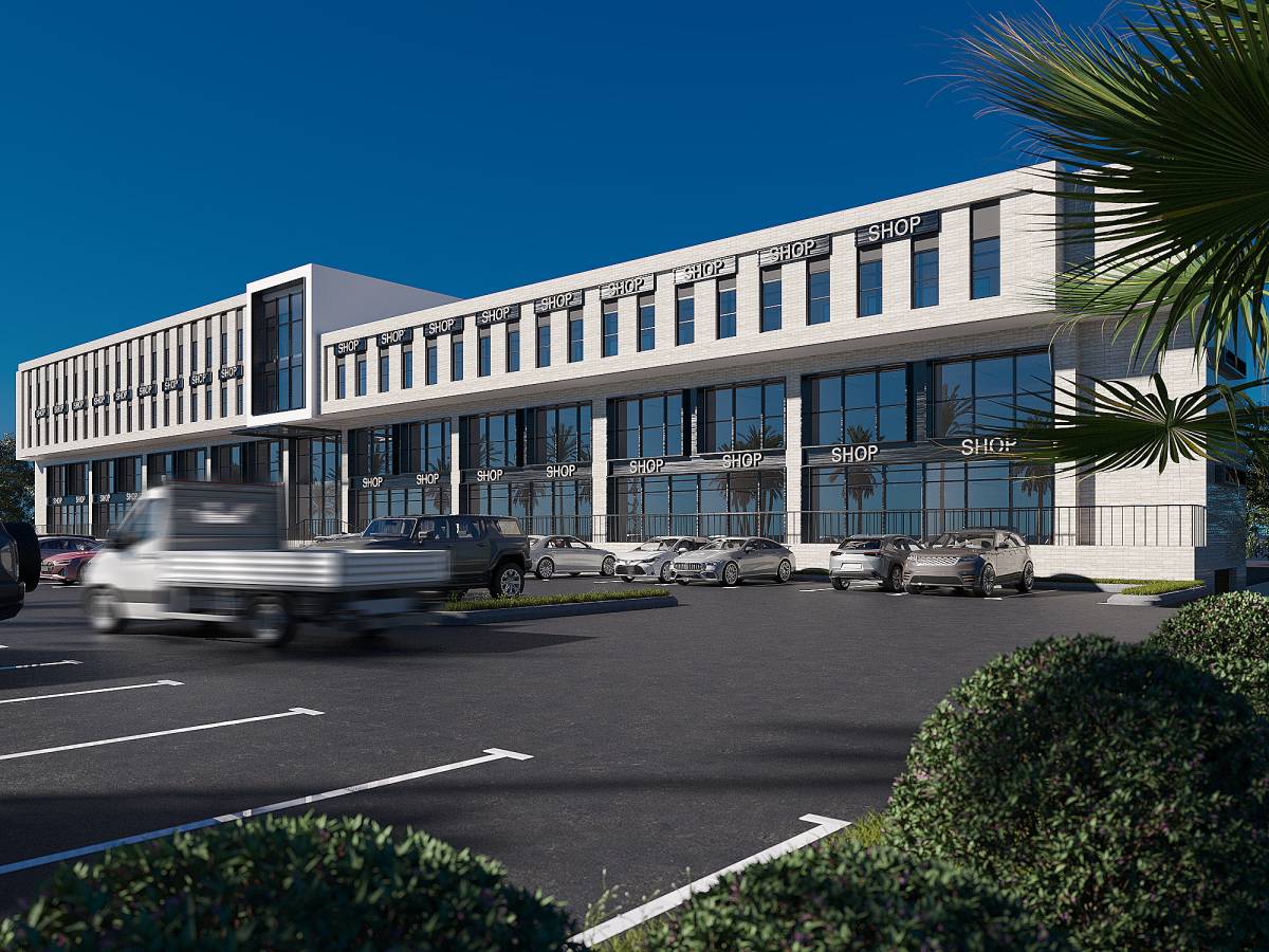
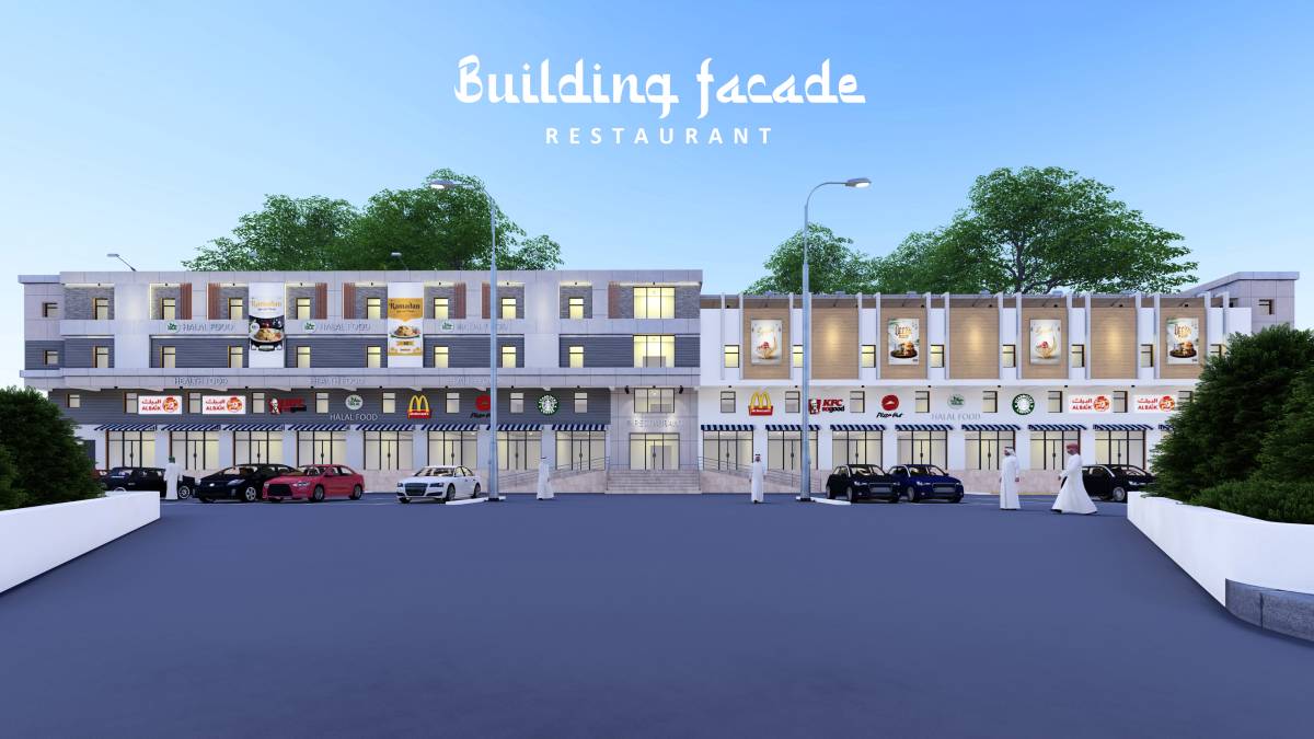
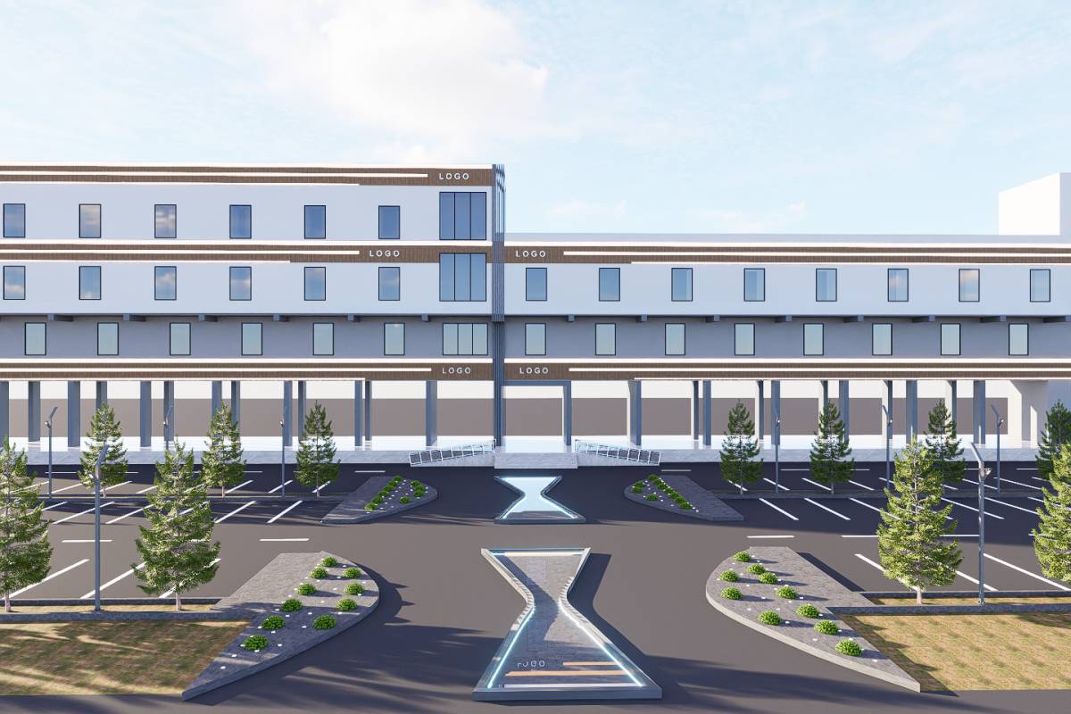
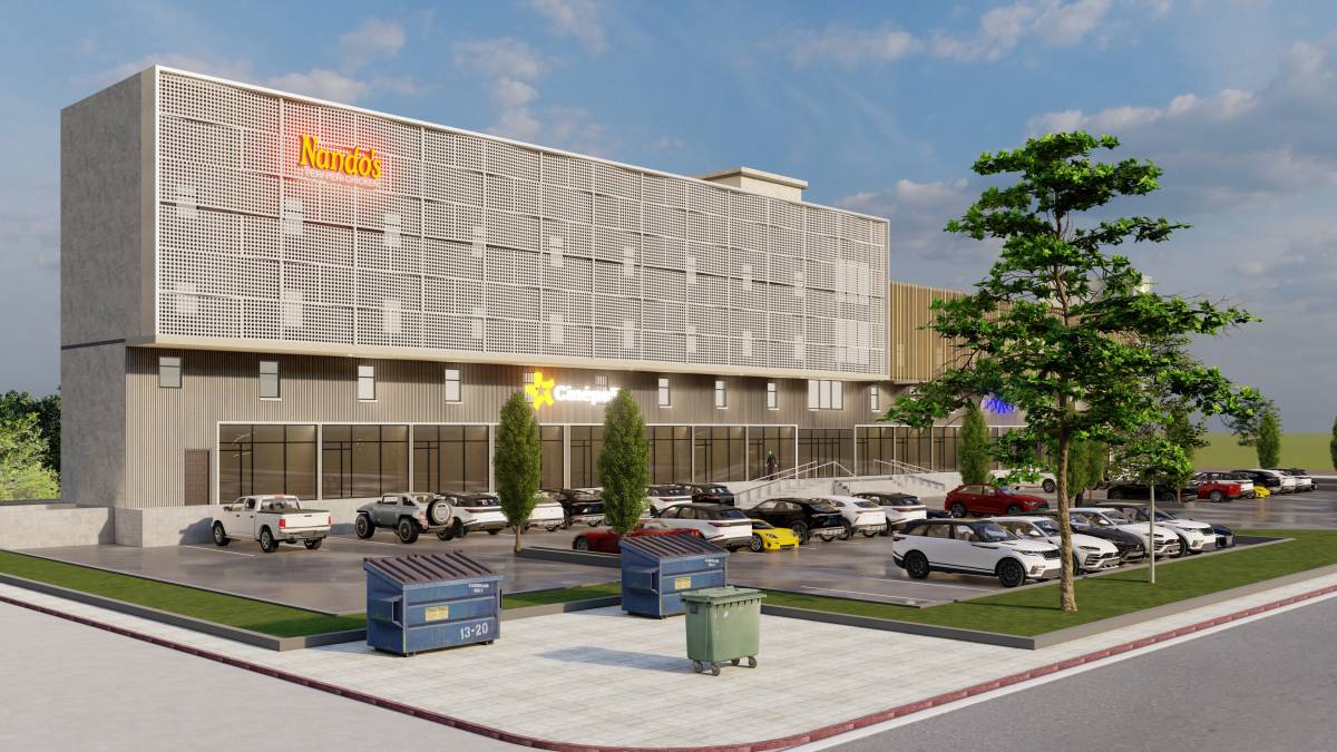
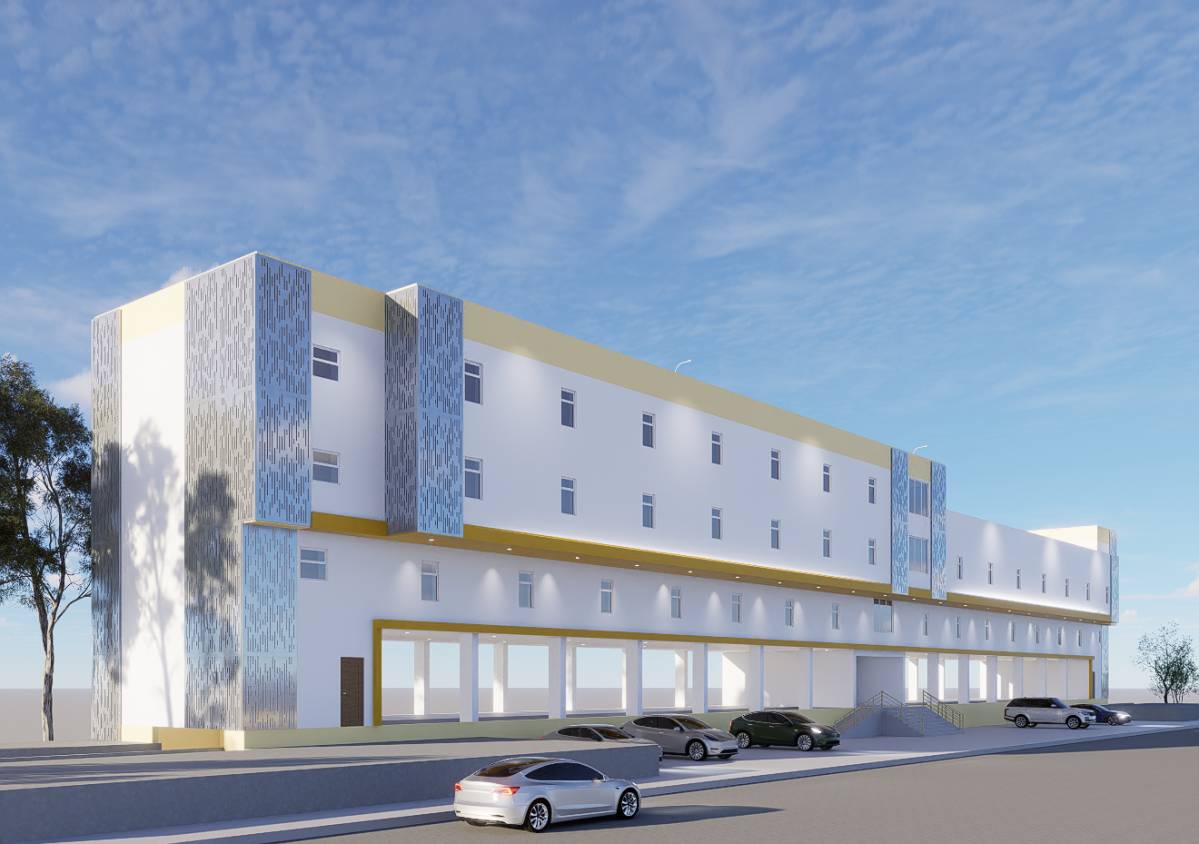
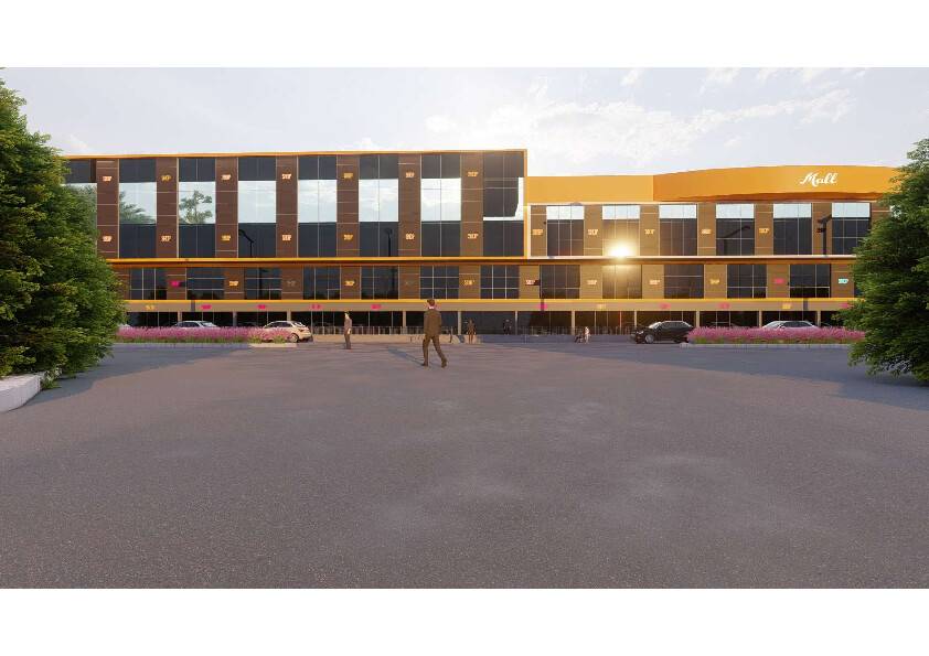
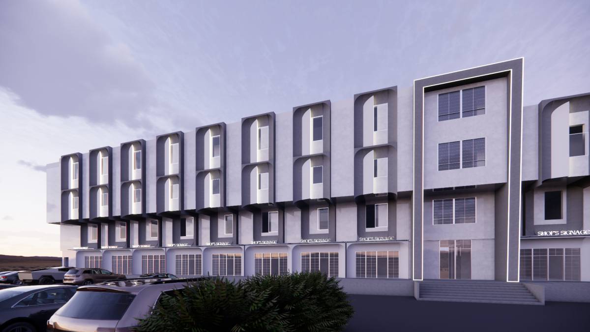
In this proposal, the first and second floors have been rendered in a darker shade of grey (achievable through either paint or paneling), to create a sense of groundedness and highlight the entrance area.
To enhance visual rhythm and balance, four grey rectangular volumes have been introduced across the third and fourth floors. These create horizontal movement for the eye while maintaining visual stability across the façade.
The restaurant signage is integrated into the central grey rectangle. To ensure legibility, a white font is recommended, offering a strong contrast against the grey background.
The skyline is carefully defined in this concept as well, reinforcing a clean and composed silhouette.
Parking Design (Common to Both Concepts)
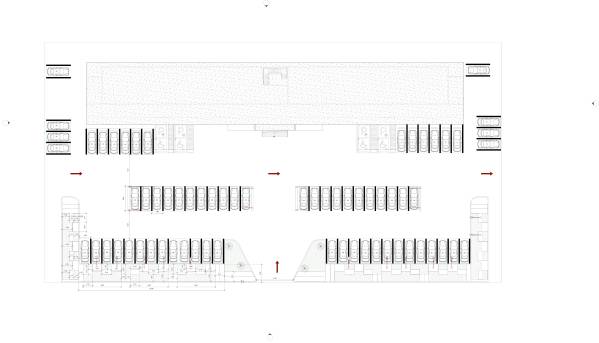
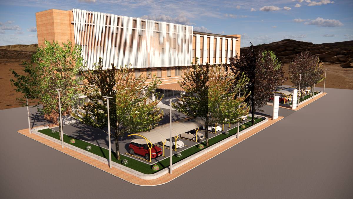
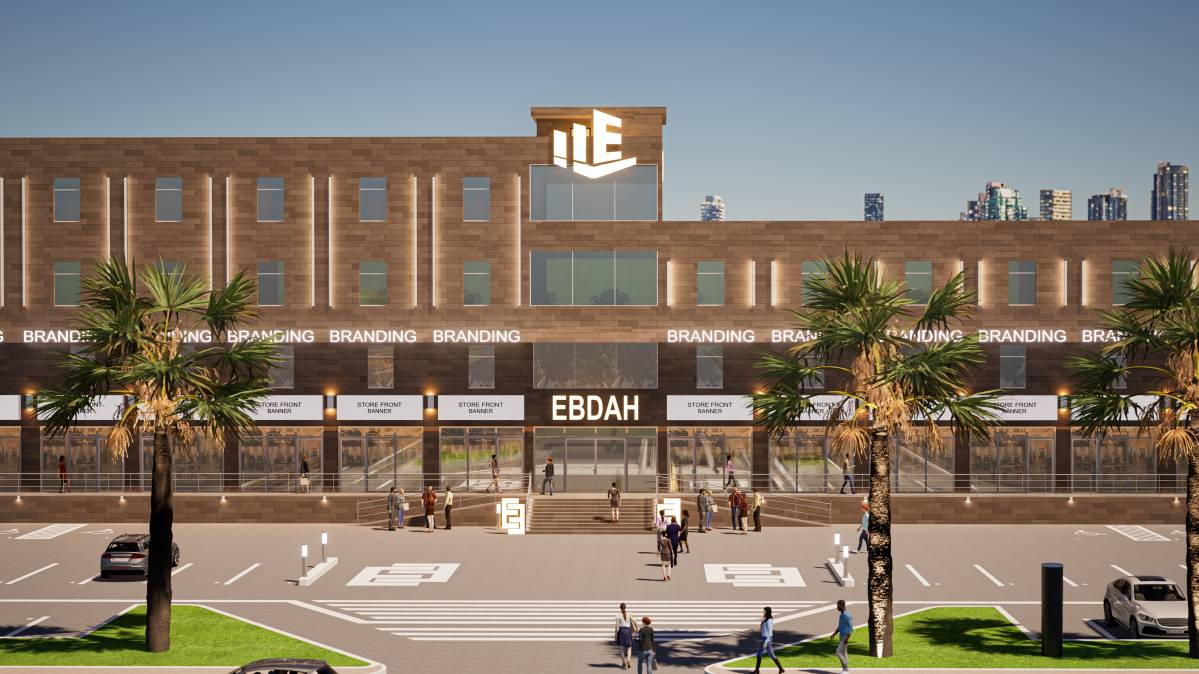
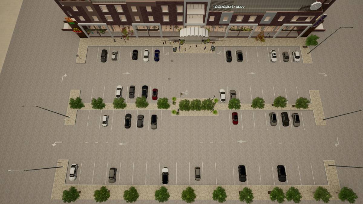
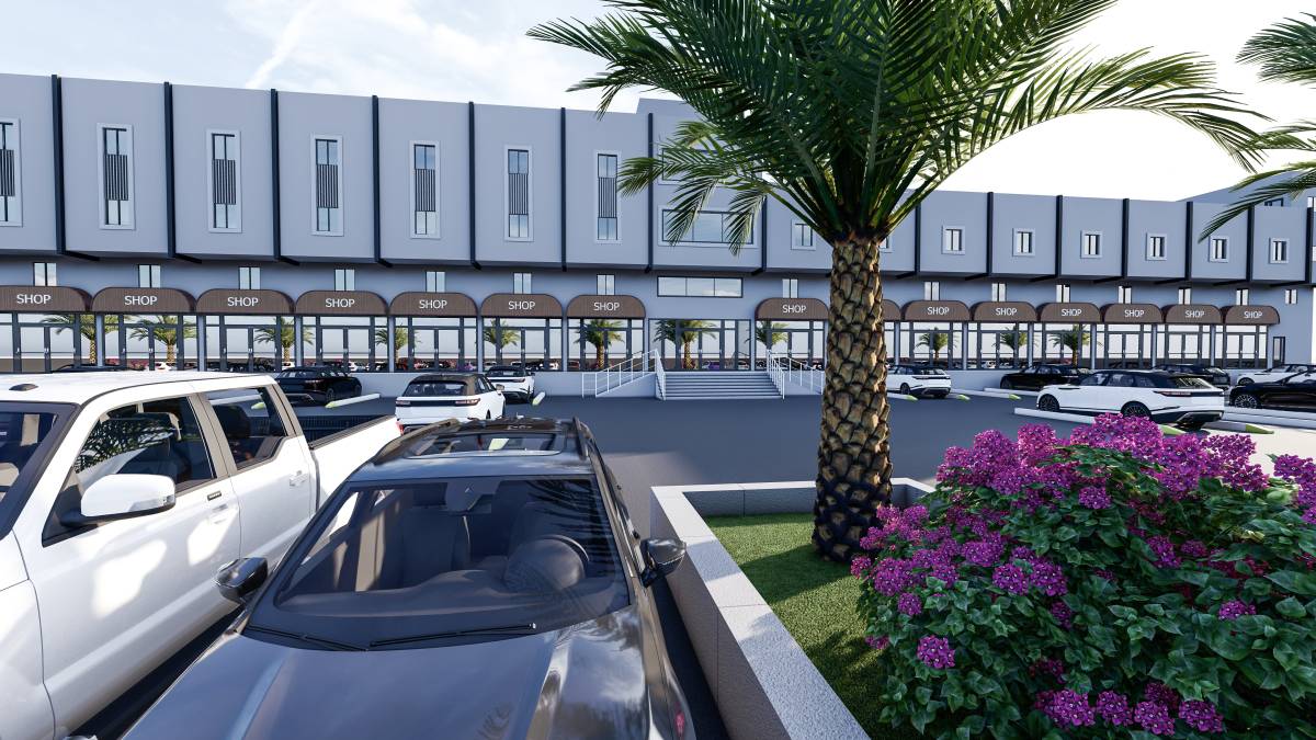
The parking layout includes 72 total spaces — 68 regular and 4 dedicated accessible spots. The design prioritizes clarity, safety, and ease of navigation. Each parking bay is equipped with a wheel stop to prevent vehicles from encroaching on the landscaped areas.
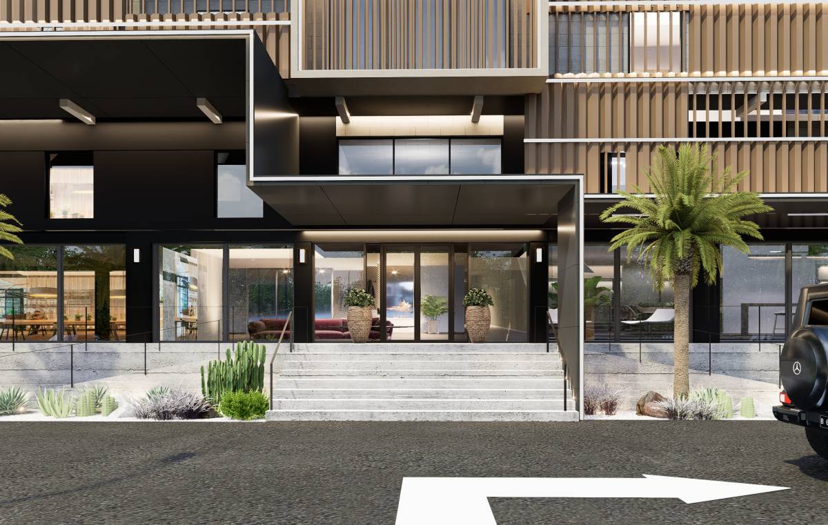
The garden layout within the designated zone has been refined: rectangular stepping stones are arranged in a rhythmic pattern, with gaps left between them for planting. This creates a balanced interplay of greenery and hardscape, enhancing the entry experience.
Best regards,
Fariba Ansari
Architect & Designer

 Выбор проголосовавших